Pitchbox ❤️ Looker
Create Custom Pitchbox Reports and Dashboards With Google Looker Studio
Create Custom Pitchbox Reports and Dashboards With Google Looker Studio
We love reports! That’s why we have native reports that offer deep insights into Pitchbox activity. However, your outreach strategy may have KPIs unique to your processes; this is where Pitchbox Connectors come in. With our Looker Studio integration, you can now create engaging reports to visualize and share important data.
Data Segmentation
Pitchbox collects a lot of data as you manage campaigns, build relationships, and win backlinks. Harness that data to identify and analyze information relevant to your specific goals. Whether you need a high-level overview of project performance or granular insights into individual outreach efforts, our Looker Studio integration empowers you to create reports tailored to your unique needs.
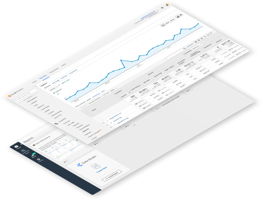
Blended Datasets
Pitchbox’s Looker Studio integration enables you to make data-driven decisions based on a holistic view of your organization. Easily combine data from multiple tools to create a comprehensive report that includes information from all facets of your business.
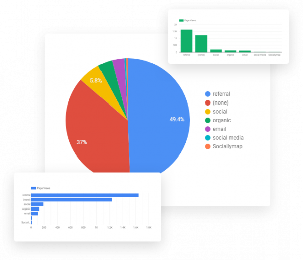
Unparalledled Customization
Transform your data into captivating charts, graphs, maps, and more. Use logos and branding to customize reports for client presentations. Share dashboards with team members and management for streamlined collaboration. Pitchbox’s Looker Studio integration enables you to communicate insights easily and effectively.
Whether you’re an agency showcasing results to clients or an SEO manager providing executive insights, Pitchbox’ connectors will help you create impactful, real-time reports.
Agencies
Reporting to clients can be a daunting task. Now, you can use Pitchbox connectors to easily create and share custom Looker Studio reports with your clients, and they can see the results for themselves in real-time.
Demonstrate the value of your services and foster trust by showcasing the impact of your link building campaigns using our Won Opportunity Report template.
SEO Managers
While SEO Managers handle the nitty-gritty of the daily link building grind, executives want the BLUF—the bottom line up front. Use Pitchbox’s Looker Studio integration to report on custom KPIs that enable informed strategic decisions.
Check out our Project Status Report template and see how you can easily produce high-level overviews.
Looker Studio is a free data visualization tool that transforms data into engaging and easily comprehensible dashboards and reports. With Pitchbox’s Looker integration, you can create custom reports using your Pitchbox project, campaign, opportunity, outreach, and link monitoring data.
Pitchbox’s Looker Studio integration makes it easy for anyone who doesn’t consider themselves “tech-savvy” to create custom, sharable reports and dashboards: no coding required.
Looker’s intuitive drag-and-drop report editor makes it simple to craft your data narrative utilizing various chart options, such as bar charts, geo maps, pivot tables, pie charts, and more. You can even go beyond static reports by incorporating clickable links, viewer filters, and date range controls.
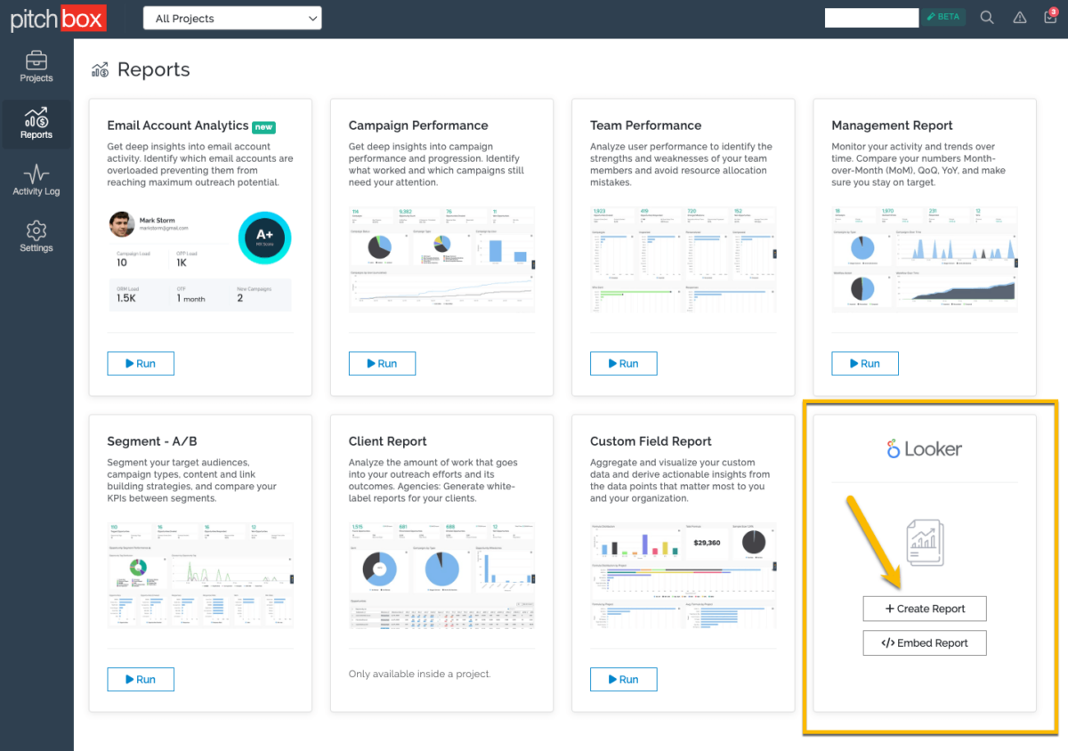
To get started, go to Reports (left side menu) and click + Create Report in the Looker block.
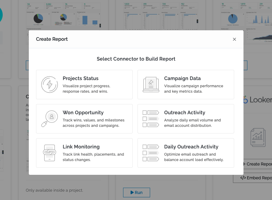
Next, select the Connector that best suits your reporting needs.
And finally, follow Google’s Authorization prompts.
For more detailed instructions on connecting your account to Looker Studio and creating reports with Pitchbox Connectors, see our Knowledge Base article.
Explore our library of pre-built reports designed to streamline your reporting process. From campaign performance summaries to outreach activity breakdowns, our templates cover a wide range of reporting needs, saving you time and effort
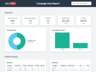
Visualize campaign performance and key metrics data
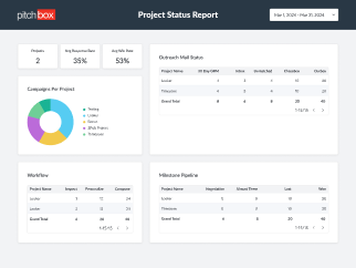
Track project workflow and pipeline activity
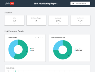
Track placements, link health, and status changes
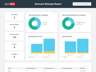
Optimize email outreach and balance account load effectively
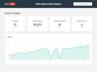
Track win data, including value and placement insights
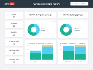
Visualize outreach sequence performance across projects